At a glance display with real time updates
The dashboard for the Victron Remote Management portal has been completely re-imagined.
Combining a diagrammatic presentation
Combining a diagrammatic presentation of the installation with historic information it now presents the data in real time, updated every two seconds.
- Familiar schematic presentation.
- Dynamic live data for Loads; Charging; Grid Feed/Draw; Tank levels etc.
- Detail is amplified when cursor ‘hovers over’.
- Battery charge cycle Bulk/Absorption/Float shown.
- Cumulative Consumption/Production/Grid feed for selected period.
- Local Temperature Time and weather.
At-a-glance status information
The goal was to produce complete at-a-glance status information for every kind of installation, on a single page.
The schematic style is familiar to us from ‘GX’ device displays. The example above is from an installation on board a boat and includes four tank levels – provided both as a percentage, and intuitively ‘shaded’ levels. More detailed datasets are presented when the cursor is hovered over graphical presentation.
Real Time Data
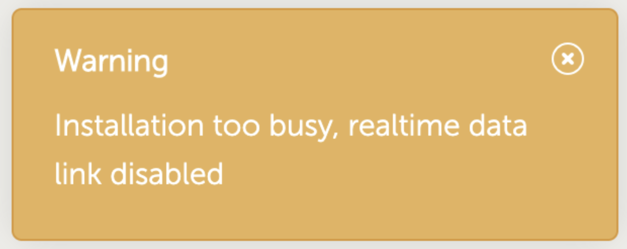
Real time data requires two-way communication between VRM and the Installation. The new dashboard increases the GX CPU load. Data usage is also increased. Both CPU load and extra data usage are only increased while the dashboard is being observed. To mitigate the extra loading, live data communication will automatically be suspended if the GX CPU load becomes too high; then the data will be refreshed as per the interval configured on the GX Device.
When live data has been suspended a warning will appear:

If the VRM portal is left open in a tab which is not in focus on your device, live reporting will be suspended after one minute.
For more details, see the manual.
